Accessibility (sometimes abbreviated a11y because there are 11 characters between the a and y) matters a lot because, without it, we’re leaving a larger segment of society out than you might think. You’re also helping more people than those with disabilities by making content accessible.
You can do several basic tasks to make eLearning course content more accessible. Review each section below to learn what to look for to make content accessible. Each section below covers general tips for making eLearning courses accessible. Sections with Storyline-specific steps are also available since we’re most familiar with that.
Many rapid course authoring tools include accessibility tools. You must look up information about your tool if using something other than Storyline. When we build any digital training solution, from training videos with subtitles to job aids with alt text, we always make it with accessibility in mind.
For the sake of your process and training, start building habits now to build accessible content from the beginning. That means you have to design for it and get used to taking advantage of all the tools available to make content accessible.
Start habits to build accessibility into your process. Don’t leave it as an afterthought.
Storyline and other Articulate tools come with a lot of accessibility features built-in. We started with their guide on building an accessible course with Storyline as a reference in many parts of this article. We provide a lot more context, other tips, and many other resources. Their article is helpful, too, but we wanted to expand upon it.
Designing for accessibility starts with knowing the basics and entering an accessibility state of mind. This will not only help your designs, but it will also help the people you’re designing instruction for.
But how do you get into an accessibility state of mind?
Accessibility State of Mind
Accessibility starts with the basics. Before you start getting into specifics about alt text, focus order, etc., it all starts with basic information about designing for accessibility in general.
Learning to get into an accessibility state of mind starts with learning about the accessibility of the internet in general. That’s because courses are opened in a web browser and are essentially fancy interactive websites.
All major rapid eLearning authoring tools today export content into HTML, which is the language of the internet.
So, to get into an accessibility state of mind, a great place to start is the W3C, the World Wide Web Consortium. They develop standards around the web, which also include a lot of standards for accessibility. You can also find an extremely valuable page with all the basics of designing for web accessibility.
On our resource page, there’s a checklist you should download to make Word Documents accessible. Many of the general items on that checklist also apply to courses.
Here’s an overview of what you can do to understand the basics of web accessibility and, by extension, course accessibility.
Provide Sufficient Contrast
Provide sufficient contrast between two elements, typically the foreground and background. That means no yellow text on a white background or dark text over an image that doesn’t provide sufficient contrast.
There are many tools online you can use to analyze two colors and see if they provide proper contrast. The ideal contrast is 4.5:1 for standard text, 3:1 for 14pt or greater bold text, or 18pt regular weight text. You can use tools like the downloadable Color Contract Analyzer (CCA) by TPGi or an online tool such as the WebAIM Contrast Checker.
Don’t Rely on Color Alone to Convey Information
This is commonly overlooked but is simple to do. That means you shouldn’t rely on only color (color blindness is a thing) to convey important information. Red text, meaning required, isn’t good enough, and neither is saying the red line is Republicans and the blue line is Democrats.
Also, on a quiz, don’t label answers by color; label them by color and number. That’s why it’s often preferred to have links in a different color and underlined. Though it’s common not to see this anymore, it’s more accessible.
If you want to see what things look like with different vision impairments, check out the Color Oracle.
Interactive Elements Should Stand Out
Interactions in a course aren’t always obvious or accessible. It’s best to make an alternative to an interaction, or you risk making it difficult or impossible for some people.
If more information is hidden behind a button, make sure you make that clear either in the narration or on the screen. Also, give people another option for accessing the information.
Use Consistent Navigation
This may not be an issue in most courses, especially if you use standard navigation elements. That’s the best way to stick to accessible design because it’s typically built into the player. Storyline has many tools to make its players accessible. You risk losing that by customizing things too much, so always stick to consistent and built-in navigation.
Getting too creative is a great way to make your course not work or be too obscure to where people aren’t used to it and can’t figure it out.
If you present tips behind a button, keep them in the same or similar place. That could make all the difference in making things easier for the user and content a little more accessible.
Clearly Label Forms
All form fields should have a clear text label inline or near the form field. Don’t try to get too creative with form fields.
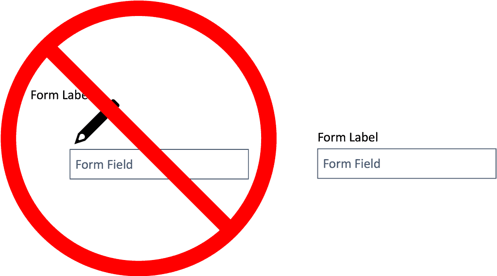
If you use graphics as a form element or label, ensure they have alt text. For any other form elements you have, make sure those also have a descriptive label.
Use Simple Language
It’s always a good idea to write at the level of your audience’s reading capabilities or possibly a few levels below. This makes things clear and helps those with cognitive disabilities understand content better. Of course, this won’t always apply because your audience may be higher education professors or doctors.
Use your best judgment when using language that makes sense to your audience. That means, if possible, to stay away from jargon and acronyms. At the very least, define acronyms often so they’re understandable to all.
Use White Space
White space always makes eLearning look better. It also has the benefit of making the content easier to understand. There are infinite reasons to use a healthy dose of white space, so don’t skimp on it; it’s free.
Always Put Users in Control
If you have a video, make sure you provide controls for it. If there’s audio, include the ability to control the audio volume and turn on captions. That could be a play/pause button or a way to skip ahead or rewind (old school).
Describe Links
Click here isn’t very descriptive or helpful. So, use things like””send us an emai””that’ss a link instead of something like””click here to email u”” with only the click here text linked. It’s easier and more helpful to everyone (including screen readers) if you describe links and/or what will happen once clicked.
Now that you have more of the basics of designing accessible courses (and other content), let’s get into some specifics.
Screen Readers/Braille and Navigating with A Keyboard
While writing this article, I also explored using a screen reader and navigating with the keyboard. I have a newfound respect for those who can accomplish it. It’s a monumental challenge, and I had a hard time, often reverting to the touchpad.
But, some have no other choice but to use a screen reader or even braille machines while navigating with their keyboard. If training content isn’t built to be accessible with these tools, then that makes it even more difficult than it already is.
Using a screen reader is challenging. Design your content to make it easy for everyone using your course, even screen readers.
That’s why you should build all training content, including courses, to make them accessible to everyone. That means they need to be easily navigable using a keyboard. When read by a screen reader, they should make sense regarding the order of items read and skipping elements that don’t matter to the content (decorative graphics).
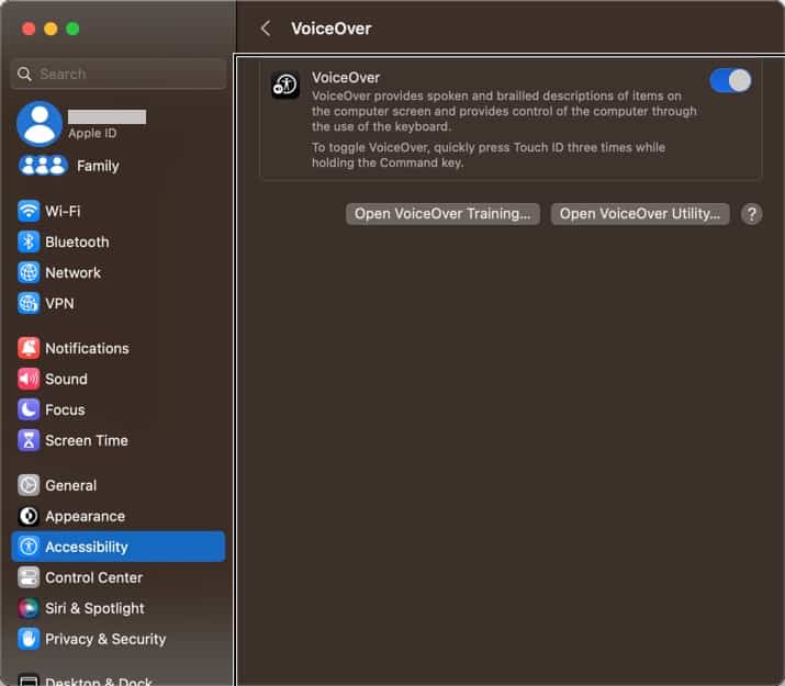
When testing, we used the VoiceOver Utility on macOS. There are also tools like NVDA for Windows, among many other options. Some items below are general options you can set up in every course; others are processes you need to account for as you build courses.
Attention to the following things will help you create content that makes your course easier to navigate with a screen reader and while navigating with a keyboard.
Focus Order
As users with a screen reader navigate, it’s helpful if the order of items flows the same way a user seeing the screen would look at it. That means the title comes first, and the content is read according to how you, the author, intended it.
As you press the tab key on your keyboard, the focus should always go to the next most important item. The focus should never jump around the page; that would not be very clear to somebody who can’t see how the screen is laid out.
Focus Order for Storyline
Articulate Storyline makes it easy to update the focus order of your course. It takes a bit of work, and you must do it right. To access the focus order configuration, click the Focus Order button on the Home tab (label 1).
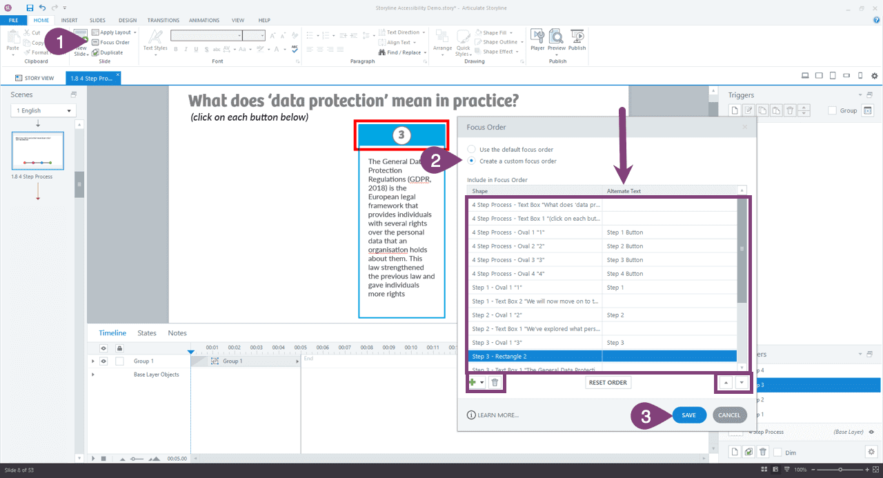
Then you can choose to use the default focus order or customize it (label 2). If you stick with the default, which is how you have them stacked in the timeline, you can delete items that shouldn’t be part of the flow of your document. That’s important because shape items unless they have important alt text and are essential to learning, don’t usually need to be part of the navigation by the keyboard.
It’s nice to skip items that are not needed. Just highlight the item and click the trash can icon to do that. You can then reorder the important elements by dragging them or using the up/down arrows. It’s a great way to help keyboard-only users get through important content easily. This is also handy for screen readers because unimportant elements can be skipped.
If you have slide layers, everything will show in the focus order window, so be sure to organize the slide layer items in the proper order. When finished, save the focus order (label 3).
Make Images Accessible
Any good tool out there for creating content that shows images (except when in a video) should make adding alternate (alt) text to the image easy. Alt text describes what’s in an image; screen readers will read it. Always include alt text for every important image in your course content. If an image is decorative, don’t include alt text; it’s distracting.
We put together an entire post to help you with alt text for documents, which is also important.
Some tools let you mark an image as decorative, but if it doesn’t, you can place “”” (with a space between the quotes) in the alt text box.
Always be thorough and descriptive when writing alt text but not too lengthy. It’s important only to include what’s important for the instructional content and not necessarily describe the entire image.
Sometimes, one short sentence will suffice, whereas you’ll need several sentences other times. For the following image, instead of saying a man watering plants for this image, you might go into more detail if the info is important to your eLearning.

A man with a beard watering a plant in a lush garden full of various tropical plants is a much better description if it is useful for learning.
An image might have multiple alt text descriptions depending on its purpose and context.
Like any good course authoring tool, Storyline makes it easy to add alt text to your images or exclude them from screen readers when they aren’t necessary to be read.
Add Alt Text in Storyline
For images that are important to your content and should be””see”” by screen readers, alt text can help you. You can add alt text to many things like hotspots, markers, images, etc.
This is an example of an image. Right-click on it (label 1) and click Accessibility (label 2).
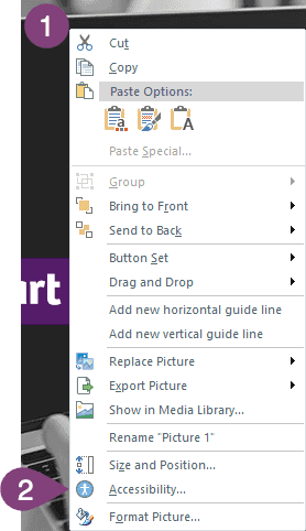
You should already be on the Accessibility tab (label 3). Now you can choose whether the image should be visible to accessibility tools (such as a screen reader) or not (label 4).
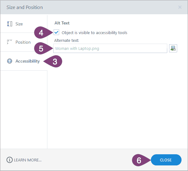
Finally, type in a good image description (label 5).
Once you’re done entering your alt text, close the window (label 6), and it will be saved.
Make Audio and Video Accessible
Audio and video can be made accessible by providing captions or subtitles. What’s the difference between the two? Captions include spoken words, noises, music, mood, and anything that can be heard. Subtitles are words that are spoken only. Captions are the only truly accessible version, but subtitles are typically more than sufficient for training unless other sounds are required to learn.
Any good course authoring tool includes subtitle or caption abilities for your audio. Video can be a bit more tricky. It depends on how you include the video in your course. You can embed video in many courses, but this isn’t ideal, and most LMSs where a course is stored aren’t meant to serve video.
All audio and video content should have subtitles at a minimum. They help more than just those requiring them.
The best way to serve video content is through a video hosting platform. Using a video hosting platform, you’ll typically create your subtitles using the video tool you made the video with or a transcription tool. We wrote a post that tells you the details about creating subtitles and importing them into your video hosting platform.
Even if you import your video into the tool you’re using, you can usually also import the closed caption or subtitle file.
There are two important things to remember with video content and subtitles. If you’re using burned-in captions because your video has no audio, how should braille readers read that?
A simple solution: include both the burned-in subtitles and a closed caption file that shows in the video player. That way, you have your bases covered so that the raw text of your video can be used however it’s needed.
Storyline has plenty of tools for inserting closed captions into your audio or video.
Adding Caption In Storyline
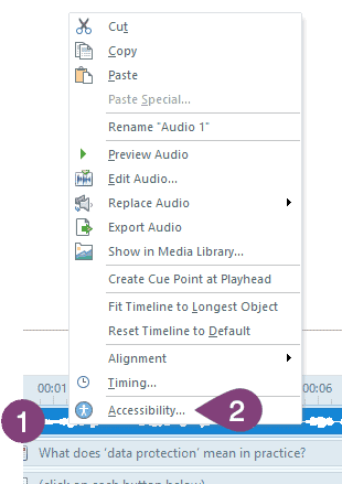
To add captions to your audio in Storyline, right-click on the audio track in your timeline (label 1) and click Accessibility (label 2).
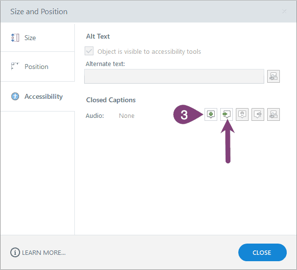
Now you can either create a caption file to edit them in Storyline (label 3) or import captions (the arrow) if you already have them in a .srt, .vtt, sbv, or .sub file.
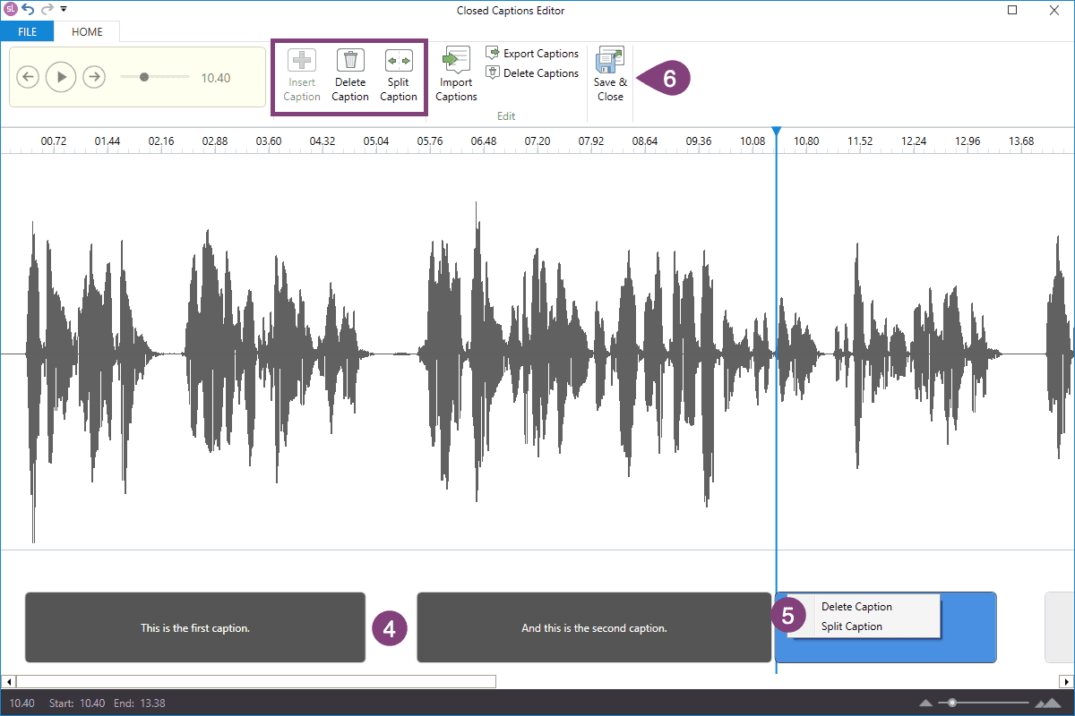
Now you have many options for editing a closed caption file which can be turned on or off in Storyline. It also gives users more power over the subtitles/captions.
Tip: Include your audio script in your notes section to provide a transcript. That’s helpful for those who don’t necessarily need captions but would still rather read content at their speed.
Storyline does a good job of inserting blank captions and splitting them up based on your audio, but you have full control over editing them. Just be sure not to make any single caption too long.
You can grab either edge of a caption to make it bigger or smaller (label 5), or you can right-click on a caption to delete it or split it into two (label 5). Those tools are also available on the toolbar (in the square) and many more tools.
Once you reach your audio file’s end, click the Save & Close button (label 6).
Tip: Once you edit the caption files, you can export those captions in .vtt format for use elsewhere. That’s super helpful because you can repurpose parts of your course (podcast, maybe) and have a caption file to go with it.
This process also works for video files, which is nice because you can post the video on a video hosting platform and export the caption file to use there.
Very handy!
Make Text Accessible
This one is mainly about readability.
- Don’t use wild fonts that are difficult to read.
- Use good contrast with your text. The thinner or smaller the text, the greater the contrast should be.
- Make text big enough to read.
- Don’t put text over a busy image that makes it hard to read text.
That’s about all you need to consider for the accessibility of text. However, Storyline offers another great feature, which is a huge benefit for text accessibility.
Text Accessibility Feature In Storyline
The accessibility controls in Storyline (learn more about them from Storyline) give users of your course several options that help make text more accessible. It lets users zoom in so the text is bigger, making text more accessible and enabling keyboard shortcuts. That last one isn’t text, but it’s still helpful.
Account For Interactive Content
Interactive content is a challenge if someone uses your course with their keyboard only. Go ahead and try using drag-and-drop interactions with your keyboard only.
There are many reasons someone might use the keyboard to navigate a course, too; you simply don’t know. Needs analysis can’t tell you if employees have disabilities. Workplaces don’t know how many of their employees have disabilities.
Drag-and-Drop
If someone can’t drag and drop because they can’t use the mouse, give them another option or a way out of the activity. Not to mention, sometimes drag-and-drop activities don’t always work how they’re supposed to for various reasons (ahem, browser cache).
I’ve experienced activities that were too complex, and people didn’t understand what to do or how to use them. Or they didn’t function as they were supposed to, and users couldn’t move forward.
There are many reasons that drag-and-drop interactions can do more harm than good. So, be sure you use them with purpose when necessary and not just to add a new feature or interaction with no purpose.
Drag-and-drop interactions can be challenging for more than just screen readers. They present difficulty to those with motor disabilities and others too.
Even if someone can use the mouse to perform a drag-and-drop interaction, they may have motor impairments that make it extremely difficult. It’s best not to frustrate people and to keep courses thoughtful, purposeful, and simple.
Avoid Hover States
This is not only a good idea because of accessibility considerations but also because it doesn’t translate well to mobile devices. They can also be a huge challenge for screen readers.
In other words, don’t display important information in hover states. Use them to show interactivity, such as with a button, or you can click something for more info. Instead of a hover state, put the information in a layer (which is accessible) and make the button open that layer.
No Timers Please
For those with cognitive disabilities (and pretty much everyone else, too), timers can be frustrating and cause unnecessary stress. There’s no reason to use a timer because it excludes rather than includes people in your content.
Additional Accessibility Settings for Storyline
A few additional features in Storyline let you make your course more accessible. They don’t fit into one specific category above, so I’m throwing the rest in here so you can make your courses as accessible as possible if you’re using Storyline.
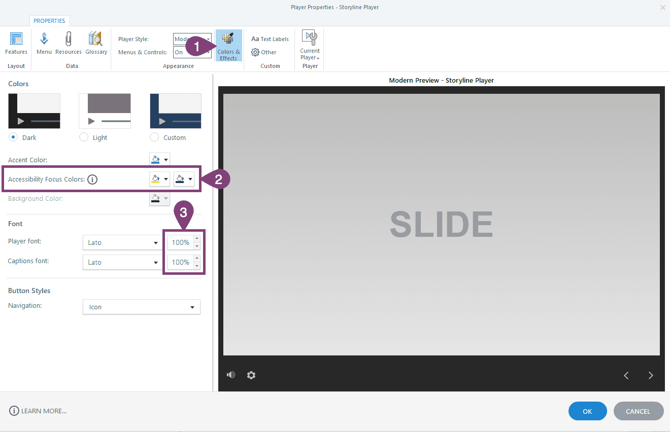
Accessible Focus Colors & Text Size
In the player configuration of your Storyline course, click on the Colors & Effects button (label 1). From there, you’ll find two options that can affect accessibility.
The first is directly related to accessibility; choose two colors that contrast well with your course for focus colors (label 2). You can also change the size of the player and captions font to a bigger size (label 3). If you know your audience well enough to know they need a larger font, increase the percentage accordingly.
Accessible Player Text Labels
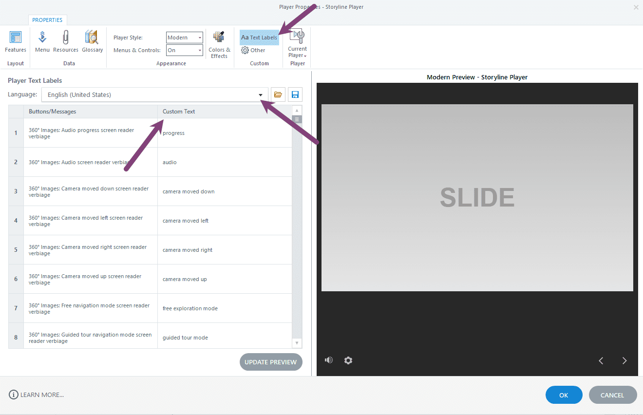
There are a few things you can change in the player settings. First, ensure your course’s language is set correctly so screen readers can display it properly.
Second, you can customize the text for buttons and messages in the players to be more useful to your audience. You likely won’t need to do this, but it may be helpful for some.
Layer Dialog Option
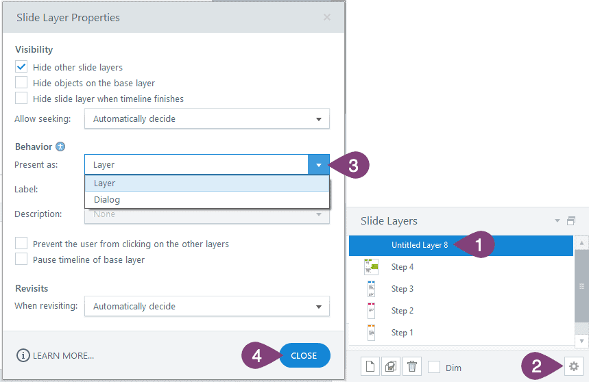
The dialog layer option is nice because when the layer opens, the focus will be on that layer. It will even focus the keyboard on that layer rather than the content on the rest of the screen. So, it provides a visual and screen reader focus for that layer, whereas a regular layer does not.
To make a layer a dialog layer, select the layer (label 1) and then click the settings button (label 2). Now you can change the layer’s behavior to a dialog layer (label 3). When you select dialog, a few settings will change in the slide layer properties window. Now you can close the layer properties (label 4), and you will see the difference.
More Accessibility Resources
There are endless accessibility resources online. If you search, you will go down a rabbit hole of resources. This section includes a few of the resources we mentioned in this post and additional resources you can use to make training content more accessible.
Since there are strict accessibility laws for certain organizations in the United States, Section 508 of the Rehabilitation Act of 1973 is helpful to at least know the basics.
There’s also a Section 508 website with many accessibility training resources. You’ll find information about making all content more accessible, including documents, PDFs, and more. We used this website to build our Word document accessibility checklist and corresponding post. The Section 508 resources are rich in information and important content.
If you’re a Storyline user, Articulate has lots of information about all the accessibility features of Storyline, and they add to it constantly. We used this resource throughout this post for the Storyline-specific accessibility content we included.
WebAIM is also another good resource. Their focus is web accessibility, which is perfect for course development. AIM stands for Accessibility in Mind.
Wrap Up
Now you should know the basics of accessibility for course development and the web in general. For the most part, they are the same, and you can apply many of these to Articulate Rise courses, too.
Creating accessible eLearning courses that consider all these things takes practice because there are many things to remember.
You should have a more accessible state of mind after reading the first section of this article. That helps give you some general pointers to remember when designing content, from color contrast to describing links.
If you haven’t tried it already, I urge you to download a screen reader and try navigating the web using just the keyboard and screen reader. It will give you a new respect for those who must do it daily.
By using closed captions/subtitles, you can make audio and video content more accessible, too. Every part of a course’s content can be made more accessible with foresight and some extra work. It’s work well worth it, though, because accessibility matters.
Every custom eLearning course we develop goes through a rigorous process to ensure accessibility. If you’d like to work on your next project with an organization that takes accessibility and 508 and WCAG compliance seriously, schedule a free consultation because we’d love to discuss your next training project with you.
